Table of Contents
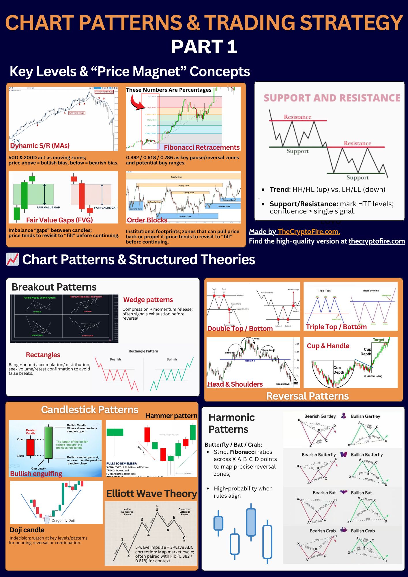
Before we dive in, grab this Chart Patterns & Trading Strategy Part 1 Cheat Sheet—a quick, printable snapshot you can keep open while you read.
📊 Key Levels & Price Magnet Concepts
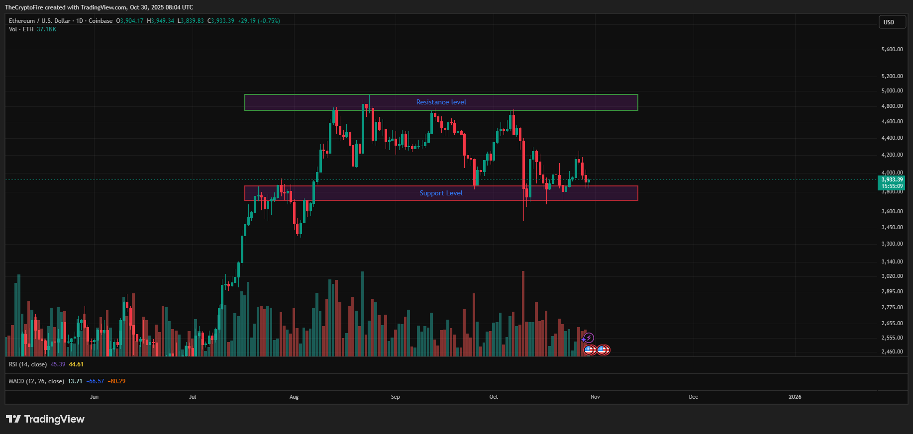
Support and Resistance
Support is a price level where buying pressure has historically outweighed selling, often leading to a bounce upward.
Resistance is the opposite, which is a ceiling where price has repeatedly faced rejection. These zones act as magnets that attract price movement, and once broken, they often switch roles.
A trader who understands how price reacts at these levels gains early insight into potential reversals or breakouts, making them essential tools for mapping trade entries and exits.
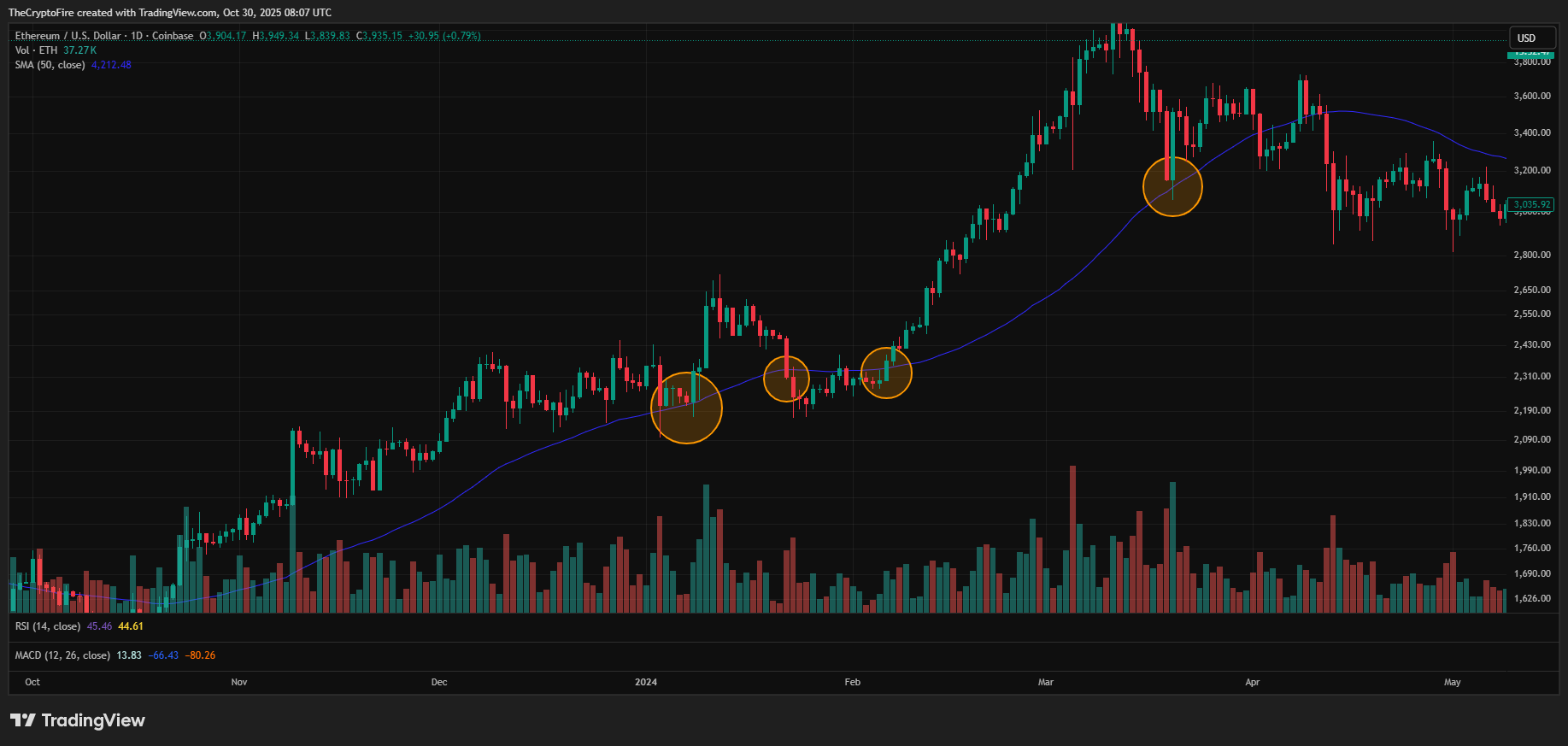
Dynamic Support and Resistance (Moving Averages, etc.)
Unlike static lines, dynamic support and resistance levels adjust with real-time market movement.
Tools like moving averages, especially the 50-day and 200-day MAs, act as flexible guides showing the overall market direction. When the price trades above these lines, it signals bullish strength; when it stays below, bearish momentum dominates.
In many trading strategies, these moving averages are not just indicators but living zones that price frequently revisits, creating opportunities for smart re-entries in trending markets.
Trend Lines
By connecting consecutive higher lows (HL) in an uptrend or lower highs (LH) in a downtrend, a trader can identify structure and momentum.
A price touching or slightly retracing to a trend line often signals potential continuation.
Trend lines can also help spot trend exhaustion: when price breaks below an upward trend line or above a downward one, it often signals a structural shift in the chart pattern.
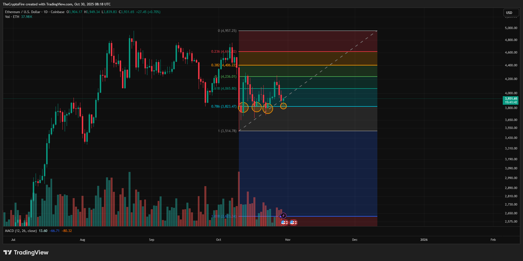
Fibonacci Retracements (0.382, 0.618 levels, etc.)
Fibonacci retracements bring mathematical structure into trading. By plotting levels between a swing high and a swing low, traders identify where price might pause or reverse.
The 0.382, 0.618, and 0.786 retracement levels are particularly powerful - a resistance for price to bounce back. They are also a range for trader to buy in.
Fair Value Gaps (FVG)
Fair value gaps, or FVGs, occur when price moves so fast that it leaves untested space between two candles, which is an imbalance of buying and selling activity. In a healthy market, price tends to revisit these gaps, “filling” them before resuming its direction.
Recognizing an FVG allows traders to anticipate a short-term pullback to equilibrium, using it as an entry zone for continuation trades.
Supply and Demand Zones (Order Blocks)
Supply and demand zones, also known as order blocks, highlight areas where large institutions have previously entered or exited the market. A strong bullish move often leaves a demand zone behind, while a sharp decline creates a supply zone
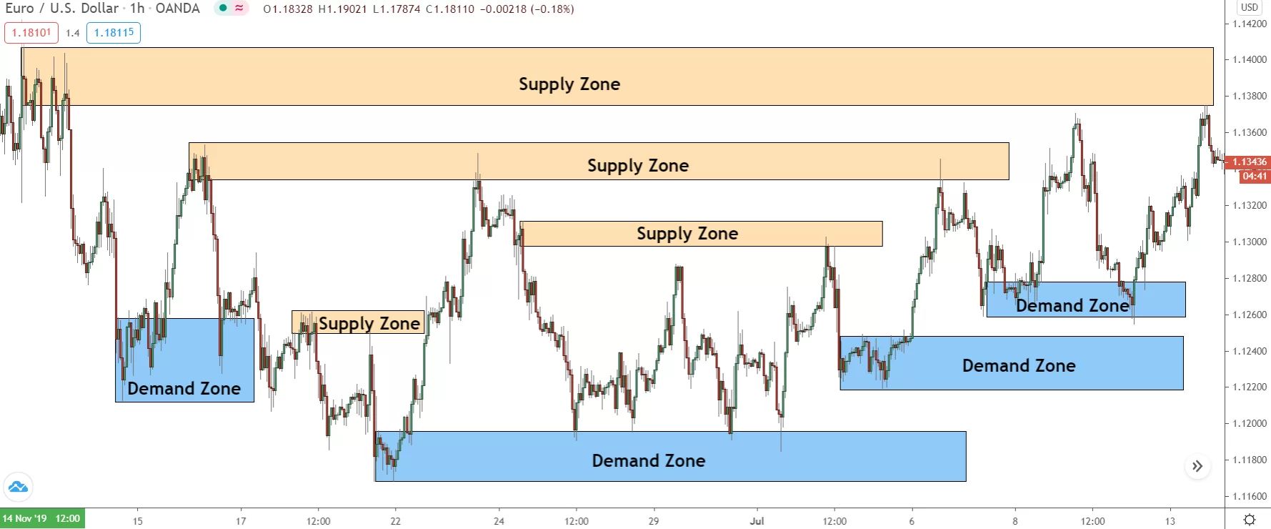
These zones act like magnets, pulling price back or pushing price up again. Understanding these key levels helps traders position themselves alongside smart money.
📈 Chart Patterns & Structured Theories
Chart patterns are the visual language of market psychology. They reveal how buyers and sellers fight for control and where the big move might emerge. Every trader who builds a consistent trading strategy studies chart patterns not just to predict, but to understand the rhythm of price itself.
Breakout Patterns
They are among the most popular structures in technical trading. They form when the market consolidates before making a decisive move through support or resistance.
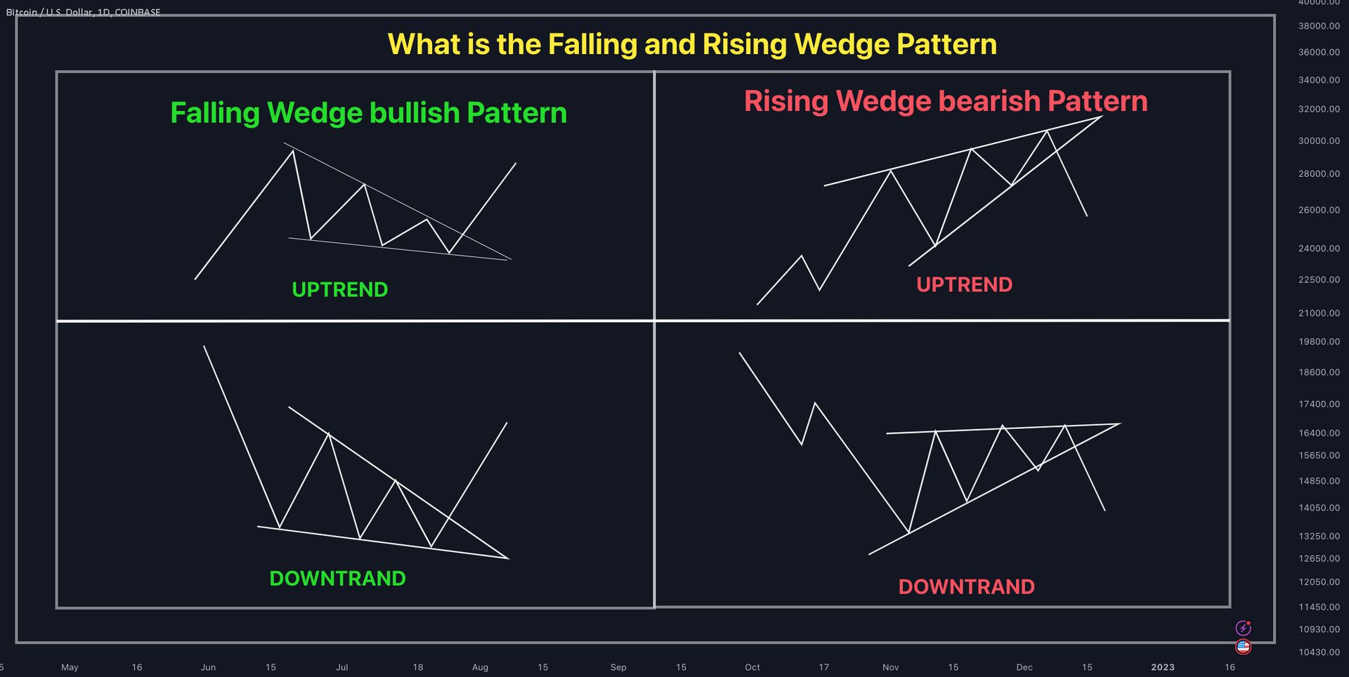
Wedge patterns (or triangles) often signal exhaustion, an ending trend preparing for reversal. Those patterns (ascending, descending, or symmetrical) represent compression, where the market coils before releasing built-up momentum.
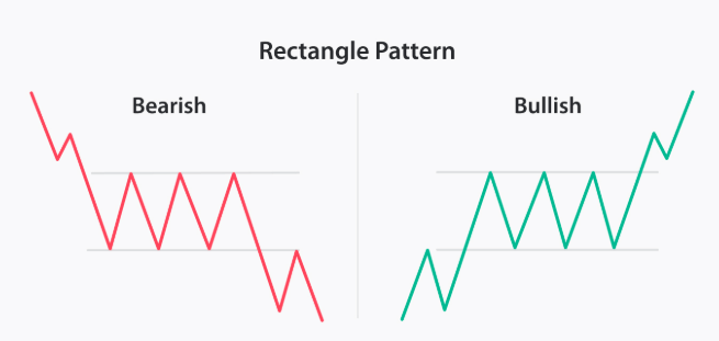
Rectangle patterns reflect accumulation or distribution, as price bounces between two clear boundaries before finally breaking out. A good trading strategy waits for confirmation by volume spikes or retests before entering, to avoid false breakouts.
Reversal Patterns
The double top and double bottom are classic chart patterns that signal a weakening trend and potential reversal.
A double top forms when price hits the same resistance level twice but fails to break higher, showing buyers losing strength before a bearish move.
Conversely, a double bottom appears after a downtrend when price tests a support level twice and holds, suggesting sellers are exhausted and buyers are regaining control.
The triple top and triple bottom are stronger variations of the double formation, offering higher confirmation that a trend reversal is real.
A triple top occurs when price tests the same resistance level three times but fails to break through, showing persistent selling pressure and exhaustion from buyers.
Meanwhile, a triple bottom forms after three failed attempts to break below a key support level, signaling that sellers are running out of momentum.
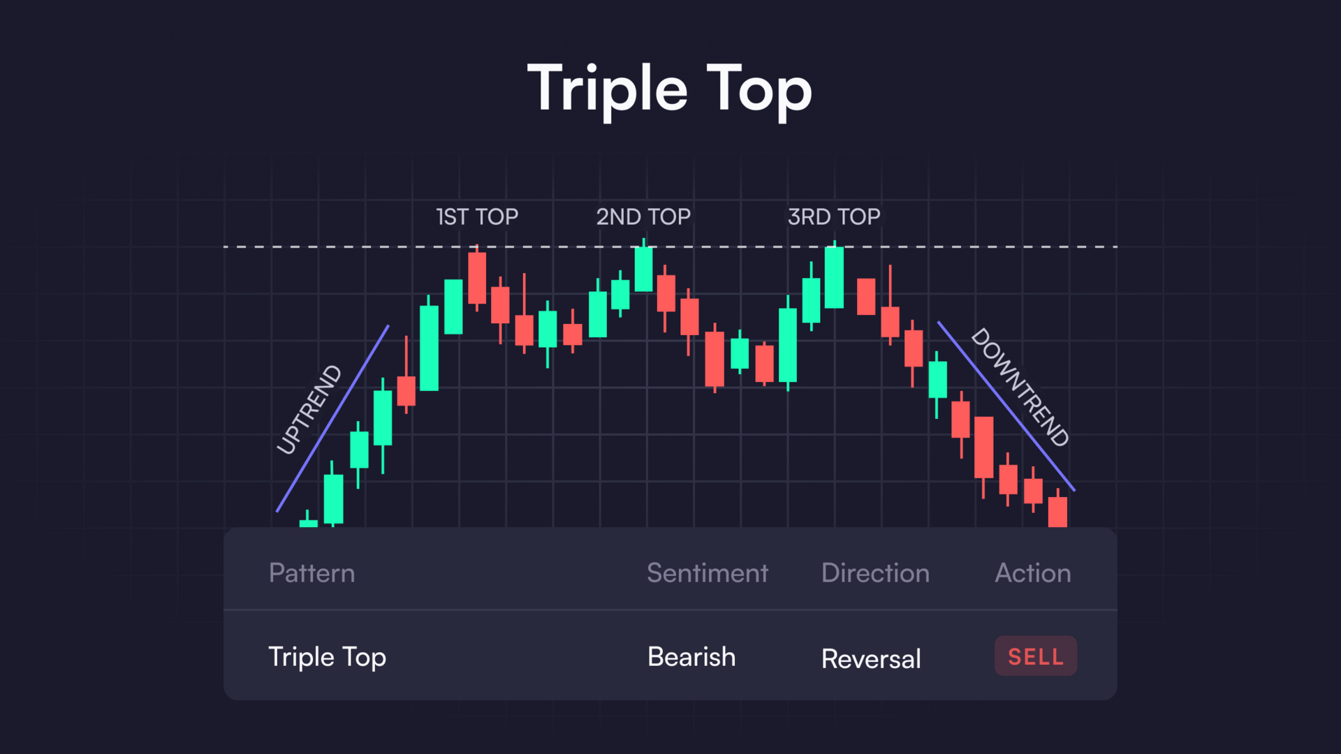
Once price breaks the neckline with strong volume, it confirms a decisive shift in trend direction.
The head and shoulders pattern is one of the most iconic chart patterns in trading, often seen as a clear signal that a bullish trend is coming to an end.
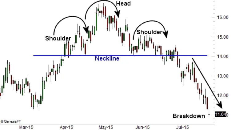
It consists of three peaks: the middle one (the head) being the highest, and the two outer ones (the shoulders) being lower and roughly equal. This structure shows that buyers are gradually losing strength with each attempt to push higher. Once the price breaks below the neckline — the support connecting the lows of the two shoulders — it confirms a potential bearish reversal.
The inverse version, known as the inverse head and shoulders, works the same way in reverse, signaling a bullish shift after a downtrend.
The cup and handle is a bullish continuation chart pattern that reflects a period of consolidation before the next leg higher.
The “cup” forms as price gradually declines and then recovers in a smooth, rounded shape, showing accumulation and stabilization after a pullback. The smaller “handle” follows with a brief, shallow retracement that often takes the form of a flag or wedge, signaling the final shakeout before a breakout.
Candlestick Patterns
The engulfing pattern
It forms when a large candle fully engulfs the body of the previous one with bullish candle opens lower than the previous candle’s close, and closes above the previous candle’s open.
A bullish engulfing appears after a downtrend, where a strong green candle engulfs a smaller red one, showing buyers overpowering sellers.
Conversely, a bearish engulfing occurs at the top of an uptrend when a large red candle engulfs a smaller green one, signaling that selling pressure has taken over.
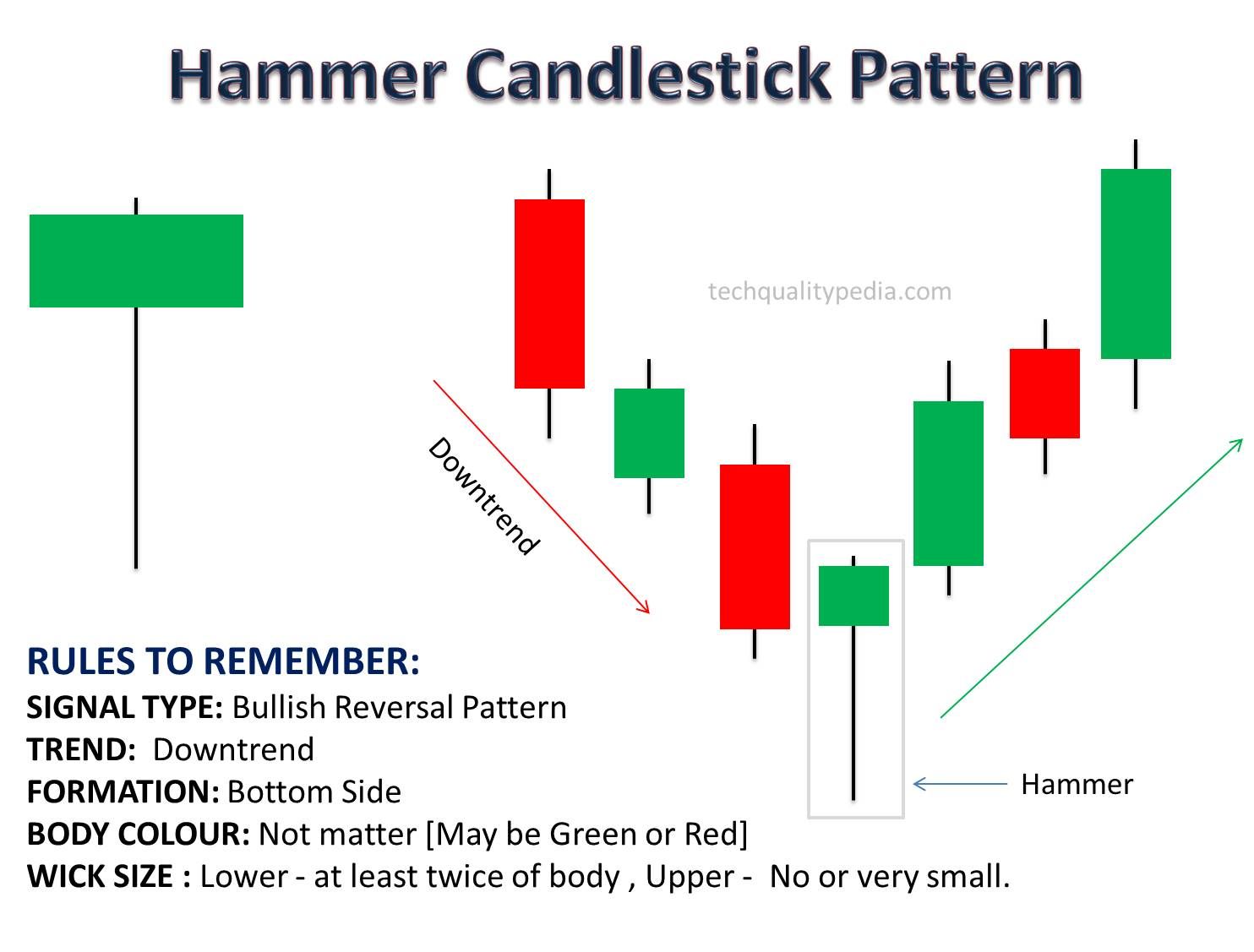
The hammer pattern, with its long lower wick, signals rejection of lower prices and potential reversal upward.
Meanwhile, the shooting star does the opposite, hinting at exhaustion after a rally.

The doji candle is a neutral chart pattern that represents market indecision, forming when the open and close prices are nearly identical. It reflects a temporary balance between buyers and sellers, showing hesitation after a strong move in either direction.
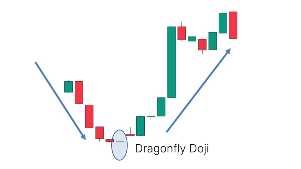
A doji often appears before major reversals or continuation moves, signaling that momentum is slowing and a breakout could follow.
While a single doji doesn’t confirm a trend change on its own, its power increases when it appears at key support or resistance levels or within other chart patterns like triangles or flags. In a well-structured trading strategy, the doji serves as an early warning to stay alert for a potential shift in sentiment.
Elliott Wave Theory
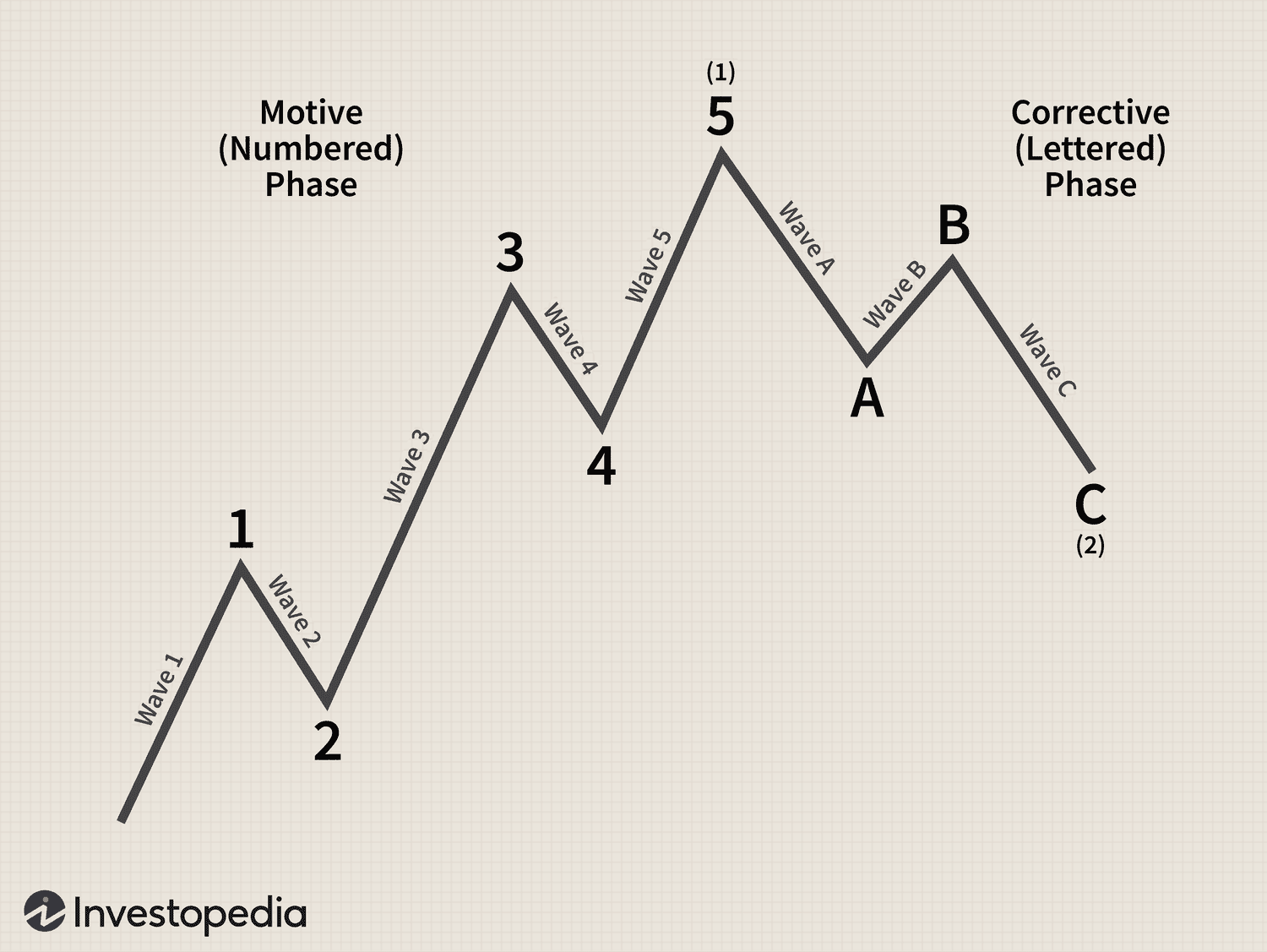
The theory identifies a five-wave impulse pattern that drives the main trend, followed by a three-wave ABC correction that resets it.
In practice, traders use Elliott waves to spot where the market stands within its cycle, anticipating whether the next move will be an expansion or a retracement. When combined with Fibonacci ratios like 0.382 or 0.618, the Elliott framework becomes a powerful part of a long-term trading strategy.
Harmonic Patterns
This pattern takes Fibonacci precision to the next level. Shapes like the butterfly, bat, and crab patterns use mathematical ratios to map exact turning points in the market. Each point (X, A, B, C, D) follows strict relationships, predicting potential reversal zones with uncanny accuracy.
These chart patterns demand patience and discipline, but when applied correctly, they provide traders with high-probability setups. Many advanced traders build their entire trading strategy around harmonics, as they merge geometry, math, and psychology into one consistent system.
