Table of Contents
Before we dive in, grab this Chart Patterns & Trading Strategy Part 2 Cheat Sheet—a quick, printable snapshot you can keep open while you read.

In Part 1 of Chart Patterns and Trading Strategy series, we explored the foundation from key levels like support and resistance to classic reversal and continuation patterns such as double tops, wedges, and head-and-shoulders.
Now, in Part 2, we’ll go deeper into advanced formations and real-world applications, focusing on how professional traders combine these patterns with indicators to build precise, high-confidence setups.
Let’s dive in!
📊 Market Structure Analysis
Market Structure (Higher Highs / Lower Lows)
Market structure is the backbone of every chart pattern and the foundation of a solid trading strategy.

In an uptrend, price forms higher highs and higher lows, showing that buyers remain in control. In a downtrend, the opposite occurs with lower highs and lower lows signals that sellers dominate.
Recognizing market structure allows traders to trade with the trend instead of technical overanalyzing. Many traders make the mistake of trying to pick tops and bottoms; instead, smart trading strategies follow the structure until it clearly shifts.
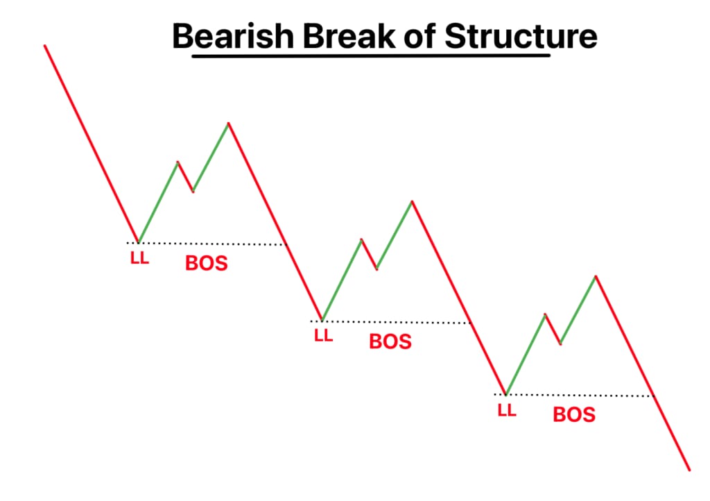
Break of Structure (BOS)
A Break of Structure happens when price breaks a previous high or low, signaling a potential continuation of the current trend. For instance, in a bearish move, if price breaks a previous low with strong volume, it confirms the downtrend. In a bullish market, breaking the last high does the same for buyers.
A breakout from a triangle, rectangle, or wedge often coincides with a BOS, adding extra confirmation for entry.
Incorporating BOS into your trading strategy helps filter false signals and gives traders confidence to ride the momentum rather than second-guess it.
Change of Character (CHoCH)
The Change of Character (CHoCH) marks the moment when the market begins to shift from one phase to another, usually from bullish to bearish, or vice versa. Unlike a simple retracement, a CHoCH shows a deeper structural change: a break in the previous swing high or low that hints at a full reversal.
For example, after a series of higher highs, if the market suddenly breaks below the most recent higher low, it signals a potential bearish reversal.
In chart pattern terms, this is often when you see formations like double tops or head and shoulders starting to play out.
Recognizing CHoCH early gives traders the opportunity to adapt their trading strategy.
⚙️ Indicator-Based Trading Strategies
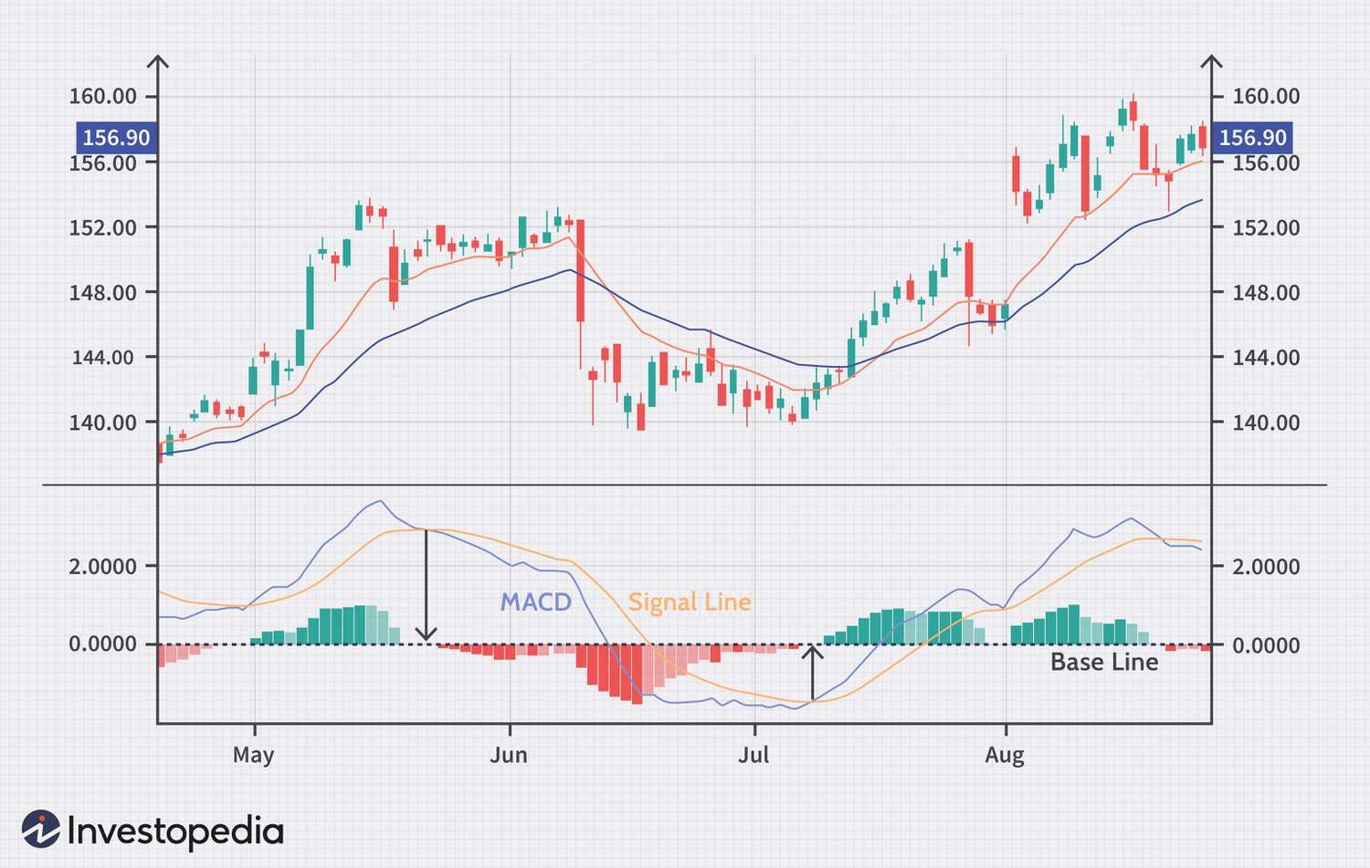
MACD (Moving Average Convergence Divergence) helps identify momentum changes in a stock’s price. It includes three main components: the MACD line (blue), signal line (orange), and the histogram (green/red bars).
When the MACD line crosses above the signal line, it’s a bullish signal suggesting potential upward movement. When it crosses below, it’s a bearish signal pointing to possible downward momentum. Traders use MACD to spot trend reversals, confirm entries, and gauge the strength of ongoing trends.
Moving Averages (MA), especially the 50-day and 200-day lines, act like dynamic trend filters. They smooth out price fluctuations to reveal the overall trend.
When shorter SMAs (like the 50-day) stay above longer ones (like the 200-day), it signals a bullish trend. When they cross below, it suggests a bearish shift. Traders use these crossovers to spot trend reversals and confirm entry or exit points in the market.
Parabolic SAR is represented by the dotted lines above and below the candles. When the dots switch from above the price to below, it signals a potential trend reversal to the upside, which is a buy signal.
Conversely, when they move from below to above, it signals a possible downtrend. Traders use the Parabolic SAR to identify entry and exit points, set trailing stop-losses, and confirm momentum direction within trending markets.
Super Trend indicator uses volatility-based calculations to show clear buy or sell signals in trending markets. The green and red lines represent trend direction.
When the SuperTrend turns green, it signals a buy opportunity, while a red turn suggests a sell signal. The dots track trend changes, and the “Buy/Sell” tags highlight confirmed signals.
Traders use SuperTrend to spot entries and exits by combining price action with volatility, it works best in trending markets, helping to filter out false moves during sideways periods
When combined with strong chart patterns, these tools refine a trading strategy by aligning momentum with structure.
Oscillators
Relative Strength Index (RSI) helps identify when the market is overbought or oversold; readings above 70 often suggest potential exhaustion in an uptrend, while readings below 30 hint at a rebound zone.
Stochastic Oscillator works similarly but reacts faster, often signaling reversals even before RSI confirms them. The oscillator measures market momentum by comparing the current closing price to its price range over a set period. It moves between 0 and 100, readings above 80 suggest the asset is overbought, while below 20 indicates it’s oversold.
Both indicators add depth to chart pattern trading by helping traders anticipate potential turning points within consolidation phases or pullbacks. When integrated into a broader trading strategy, oscillators help fine-tune timing for entries and exits.
Volume Indicators
Price Volume indicator shows how many units of an asset were traded during a specific period. High volume often signals strong investor interest and confirms the strength of a price move.
Low volume suggests weak momentum or uncertainty. Traders use volume to confirm trends. For example, a price breakout with rising volume is more reliable than one with low volume, as it shows real market participation behind the move.
VWAP (Volume Weighted Average Price) reflects the average trading price weighted by volume, acting as both a dynamic support and resistance level. Traders use it to identify fair value zones.
In this example, the price pulls back to VWAP, forms a Dragonfly Doji (a bullish reversal candle), and then breaks above VWAP, signaling a buy entry.
In any trading strategy, volume indicators are essential companions to chart patterns, validating whether the breakout, reversal, or continuation truly has strength behind it.
Divergences
Divergence explains how price and indicator movements can signal potential reversals.
Regular Divergence happens when price and an indicator move in opposite directions. Particularly, a bearish divergence forms when price makes higher highs but the indicator makes lower highs (a sign of weakening strength), while a bullish divergence appears when price makes lower lows but the indicator makes higher lows (a sign of potential reversal upward).
Hidden Divergence suggests trend continuation. In a bullish case, price makes higher lows while the indicator makes lower lows; in a bearish case, price makes lower highs while the indicator makes higher highs.
Exaggerated Divergence occurs when the price forms equal highs or lows but the indicator diverges, hinting at an upcoming reversal.
Spotting divergence within major chart patterns such as double bottoms or triangles gives traders early warnings before the market turns.
🌀 Alternative Charting & Theories
Heikin Ashi
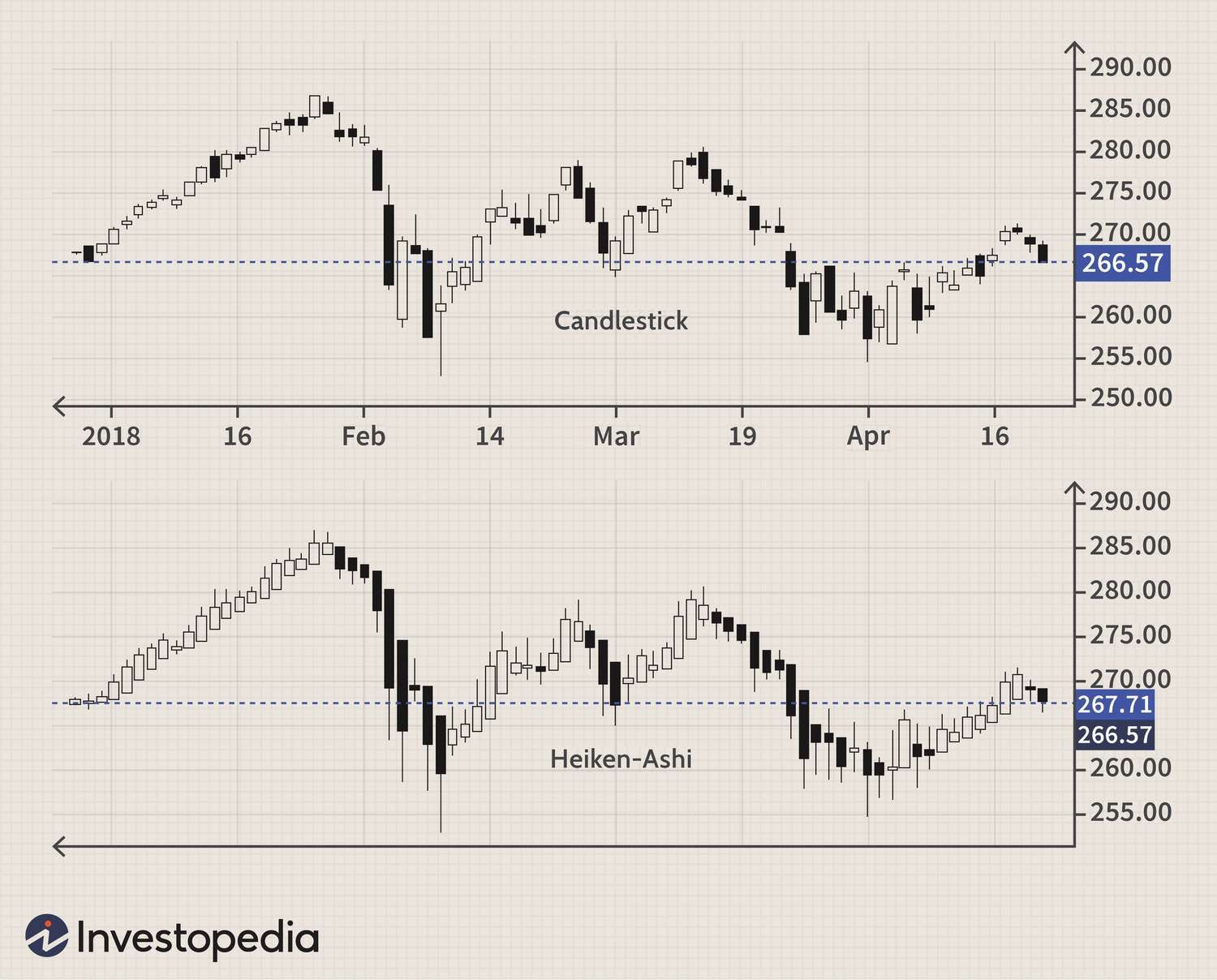
The Heikin Ashi chart is a smoother version of the traditional candlestick chart, designed to filter out noise and highlight the underlying trend. Instead of showing the exact open and close prices, it calculates average values to make price movements clearer.
A series of green candles with no lower wicks suggests a strong uptrend, while red candles without upper wicks indicate strong bearish momentum.
Many traders use Heikin Ashi charts to stay in trades longer, as it simplifies decision-making by visually confirming when a chart pattern continues or reverses.
Renko
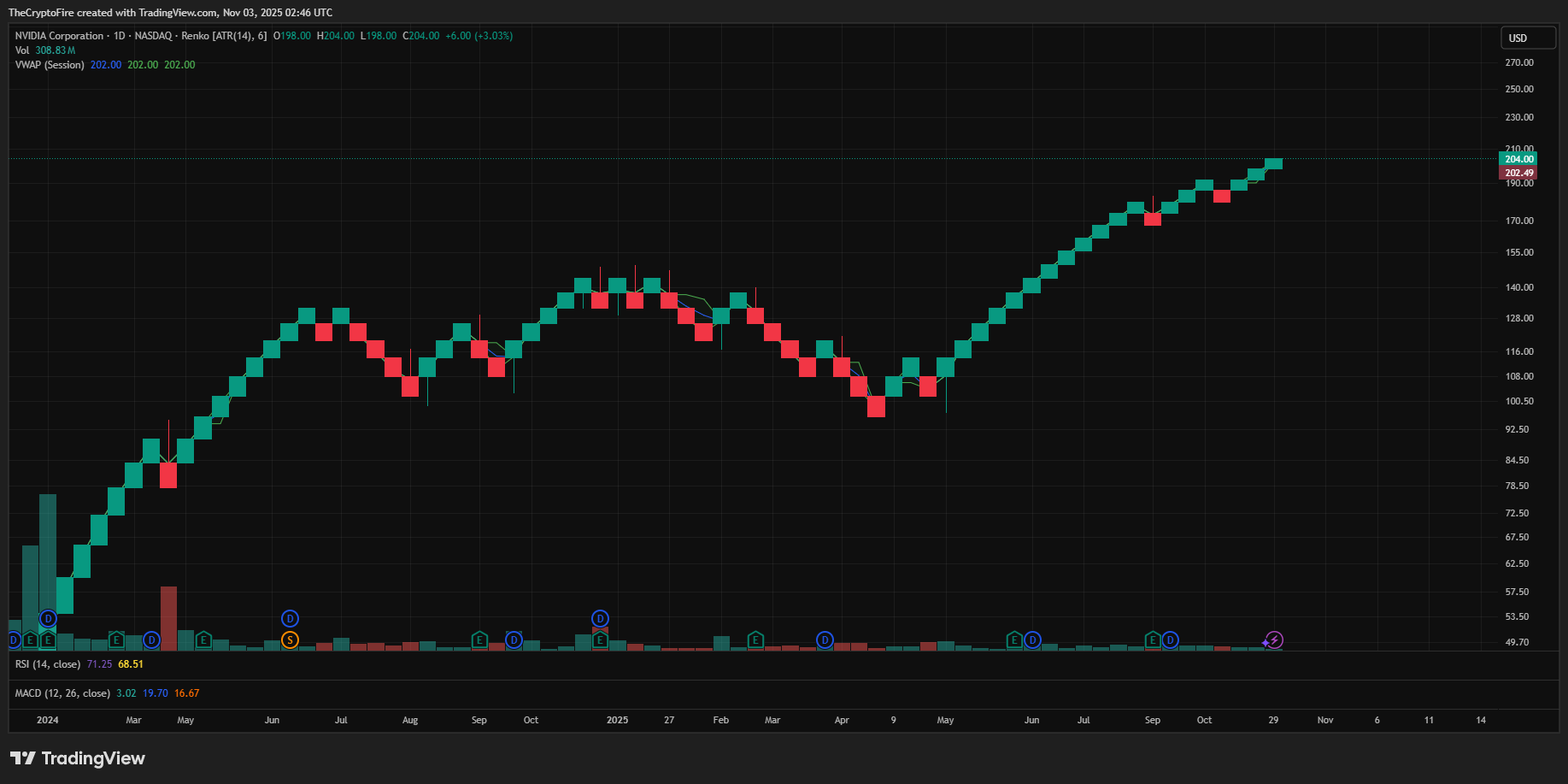
Renko charts take simplicity a step further. Unlike regular charts that plot price over time, Renko focuses purely on price movement. Each block, or “brick,” forms only after a specific price change regardless of how long it takes.
For example, every 1% or $100 move in price creates a new brick, filtering out minor fluctuations and showing only meaningful market direction.
Green (or white) bricks show upward movement, while red (or black) bricks show downward movement. This style filters out noise, making trends and reversals easier to spot.
When combined with classic chart patterns like wedges or triangles, Renko charts become powerful tools for traders developing trend-following or breakout-focused trading strategies.
Gann Angles
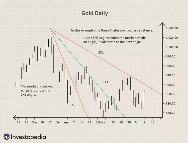
Developed by W.D. Gann, Gann Angles use geometric proportions to forecast support and resistance. They consist of diagonal lines drawn at specific angles (like 1x1, 2x1, or 1x2) from key highs or lows.
The idea is that when price aligns with these geometric angles, it reflects balance between time and price movement. Steeper angles indicate stronger trends, while flatter ones signal slower momentum.
Moon Phases
Though unconventional, the Moon Phases theory connects human emotion influenced by lunar cycles to market behavior. Historically, traders observed that markets tend to show bullish tendencies around new moons and bearish tendencies around full moons.
While not a primary signal, it’s sometimes used as a confirmation tool when it aligns with a technical chart pattern or reversal setup.
For example, if a head and shoulders pattern forms during a full moon cycle, some traders might treat it as added conviction for a bearish move.


